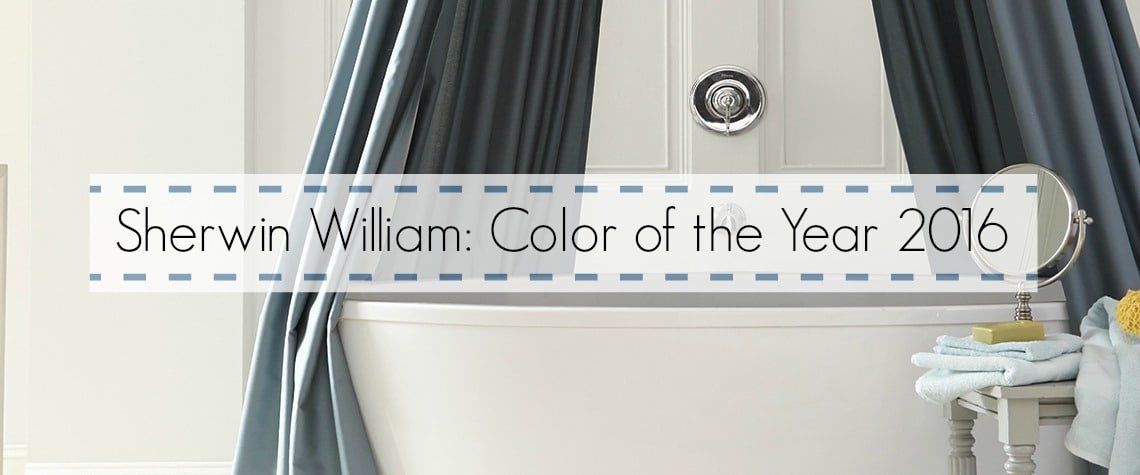
Stepping into your home should be a welcome escape from the chaos of the world, a haven of peace and comfort. In 2016, Sherwin-Williams understood that desire perfectly. They didn’t just pick a color, they chose a mood – an invitation to embrace serenity and warmth with their color of the year: “Alabaster”. This soft, creamy white wasn’t just a paint color; it was a promise – a promise of a space that felt tranquil, inviting, and truly your own.

Image: lifeonsummerhill.com
Think about it. What’s the first color you associate with peace? Chances are, it’s some shade of white. It’s the color of fresh snow, a pristine canvas, a clean slate. White evokes a sense of calm, a sense of everything being just right. But “Alabaster” wasn’t your typical stark white. It had a subtlety, a depth, a warmth that made it truly unique. Alabaster has a hint of creaminess, a gentle whisper of yellow, making it feel soft and inviting rather than stark and cold. It’s a color that invites you to relax, to breathe easy.
A Deeper Dive into Alabaster: More Than Just a Color
Alabaster truly embodied a shift in design trends. The year 2016 marked a move away from the bold and bright, embracing the power of subtlety and understated elegance. This was reflected in interior design trends, where minimalist aesthetics were becoming increasingly popular, and natural materials were taking center stage.
Alabaster perfectly complemented this evolution. It served as a beautiful backdrop for these trends, allowing natural textures and materials to shine and create a sense of tranquility. This subtle creamy white was more than just a color – it was a design philosophy. It spoke of simplicity, authenticity, and a return to nature.
“Alabaster” was a color that could be both universally appealing and distinctly personal. This is because it was a blank canvas, a blank page ready to be painted with your own unique style. It could be paired with vibrant accent colors, delicate pastels, or even bold, saturated hues, allowing you to create a space that reflected your own individual personality and preferences.
Alabaster Beyond the Walls: Its Timeless Appeal
The beauty of “Alabaster” lay in its versatility. It wasn’t just a color for walls. It could be used in countless ways, adding a touch of serenity and warmth to every aspect of your home. Picture it:
- Alabaster Kitchen: Imagine a kitchen with “Alabaster” cabinets, paired with stainless steel appliances and a light wood countertop. The space feels spacious and airy, yet cozy and inviting, thanks to the warmth of the alabaster.
- Alabaster Bathroom: Think of a bathroom with “Alabaster” tiles, a freestanding bathtub, and natural wood accents. The color echoes the natural world, bringing a calming spa-like feeling to the space.
- Alabaster Bedroom: Visualize an “Alabaster” bedroom, with soft linens, and a statement headboard. The color allows the personality of the furnishings to shine, while creating a sense of calm and serenity.
Beyond your home, “Alabaster” offered a timeless elegance that could be incorporated into any setting. It looked stunning in modern office spaces, bringing a sense of tranquility to the workplace. It brought a touch of sophistication to retail spaces, creating a calming and inviting atmosphere for customers.
Expert Insights and Actionable Tips for Using Alabaster
Sherwin-Williams wasn’t just about the color – they offered a wealth of advice on how to use it effectively. Here are some tips straight from the experts:
- Light and airy: To maximize the light and airy feel of “Alabaster,” use it in rooms that get a lot of natural light.
- Accent with color: Don’t be afraid to add pops of color with furniture, artwork, and accessories to personalize the space.
- Wood and textiles: “Alabaster” complements natural wood tones and soft textiles, creating a cozy and inviting atmosphere.

Image: fioritointeriordesign.blogspot.com
2016 Sherwin Williams Color Of The Year
A Timeless Legacy: The Enduring Appeal of “Alabaster”
“Alabaster” wasn’t just a color of the year for 2016. It was a color that continues to resonate with people today. Its timeless elegance and ability to create both calm and warmth have cemented its place in the design world. Whether you’re renovating your home or simply looking for an easy way to refresh your space, “Alabaster” offers a classic, calming, and universally appealing solution.
If you’re searching for a color that can bring a touch of serenity and warmth to your life, go beyond the trends and explore the timeless beauty of “Alabaster”. It might just be the perfect way to create a space that feels both beautiful and uniquely your own.


