Have you ever stared at a vibrant orange sunset and wondered what color would best accentuate its fiery hues? Or perhaps you’ve been captivated by the bold pairing of orange and blue in a work of art? The answer lies within the fascinating world of color theory, where understanding the concept of complementary colors can unlock a plethora of creative possibilities.

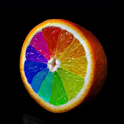
Image: srkiozwfvlrhw.blogspot.com
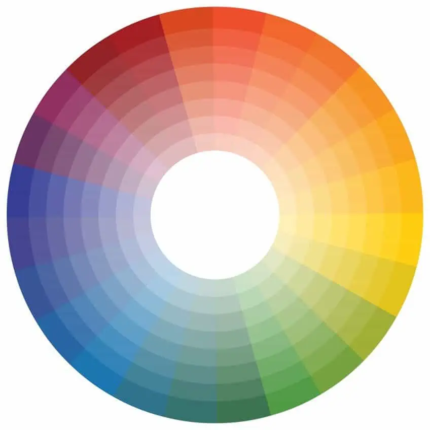
In the realm of art, design, and even fashion, the color wheel is an essential tool for harnessing the power of color relationships. This circular spectrum reveals how different colors harmonize, contrast, and even clash based on their position. One of the most intriguing and impactful relationships on the color wheel is that of complementary colors, which sit directly opposite each other. And when it comes to the vibrant energy of orange, its complementary counterpart is none other than the cool and calming hue of blue.
The Color Wheel: A Visual Guide to Harmony and Contrast
To grasp the concept of complementary colors, it’s crucial to understand the color wheel. Imagine a circular chart divided into sections, each representing a primary, secondary, or tertiary color. Primary colors, such as red, yellow, and blue, are the foundational building blocks of all other colors. Secondary colors, like orange, green, and purple, are created by mixing two primary colors. Lastly, tertiary colors emerge from mixing a primary and a secondary color, resulting in hues like red-orange, yellow-green, and blue-violet.
Complementary Colors: A Symphony of Contrast
Complementary colors, positioned opposite each other on the color wheel, possess an inherent contrast that creates a visually captivating dynamic. This contrast arises from the fact that complementary colors have opposing wavelengths on the light spectrum. For instance, orange, a warm and energetic color, has a long wavelength, while blue, a cool and calming color, has a shorter wavelength.
This inherent contrast between complementary colors is what makes them so visually striking and impactful. When placed side-by-side, they amplify each other’s vibrancy, creating a sense of depth and visual excitement. This effect is particularly pronounced in art, where artists often strategically use complementary colors to enhance the overall composition, draw attention to specific elements, or evoke specific emotions.
Orange and Blue: A Dynamic Duo
Now, let’s delve into the captivating relationship between orange and blue. Orange, with its fiery energy and association with warmth, passion, and creativity, holds a prominent place in the color spectrum. On the other hand, blue, a color often linked to tranquility, serenity, and trust, offers a welcome balance to orange’s vibrant intensity.
When combined, orange and blue create a visual spectacle that evokes a sense of harmony within contrast. The warm vibrancy of orange is beautifully balanced by the cool serenity of blue, creating a visually engaging and eye-catching pairing.

Image: kegero.com
Real-World Applications of Orange and Blue
The complementary relationship between orange and blue extends beyond the confines of art studios and galleries. It’s readily observed in countless aspects of our daily lives, from the natural world to the world of design:
Nature’s Palette: Orange and Blue in the Natural World
Nature itself provides countless examples of the captivating pairing of orange and blue. From the vibrant orange sunsets that paint the sky with hues of gold and azure to the striking contrast of an orange butterfly against a blue flower, nature showcases the inherent beauty and harmony of these complementary colors.
Design and Fashion: The Power of Complementary Colors
In the world of design, the pairing of orange and blue is a popular choice for creating visually appealing and impactful designs. From websites and product packaging to clothing and interior design, this complementary combination exudes a sense of energy and sophistication. For instance, a website using orange as its primary color might incorporate blue accents to create a balanced and visually engaging design. Similarly, a fashion designer might pair an orange dress with a blue belt or accessories to achieve a harmoniously contrasting look.
Beyond the Color Wheel: Exploring Other Color Relationships
While complementary colors are undeniably impactful, the world of color theory offers a wealth of other fascinating relationships to explore. For instance, analogous colors, located next to each other on the color wheel, create a harmonious and soothing effect. Triadic colors, spaced evenly apart on the color wheel, provide a vibrant and balanced combination. By experimenting with different color relationships, you can unleash your creativity and discover the endless possibilities of color.
What Is Opposite Orange On The Color Wheel
Conclusion: Embracing the Power of Complementary Colors
Understanding the concept of complementary colors, like orange and blue, can revolutionize your own creative endeavors. Whether you’re painting a masterpiece, designing a website, or simply choosing an outfit for the day, the power of complementary colors can elevate your creations and leave a lasting impression.
So, the next time you encounter a burst of orange or a calming expanse of blue, take a moment to appreciate the inherent beauty of their complementary relationship. You might just be inspired to create something truly remarkable.


